Why Pantone “White” as Color of the Year Is Causing a Rage Storm
© Pantone
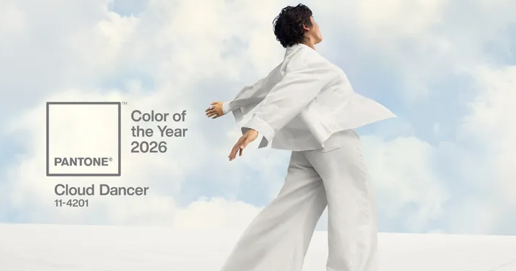
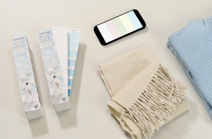
Pantone shocked many by naming a soft white shade called Cloud Dancer as its 2026 “Color of the Year.” For the first time in its annual tradition, they didn’t choose a bold hue — instead, they picked a near-white shade that the institute described as “a whisper of calm and peace in a noisy world.”
What Pantone Did — And the Backlash That Followed
Almost immediately, the decision sparked widespread criticism online. Some people called the choice “tone-deaf” or “dystopian,” others dismissed it as “boring,” “sterile,” or the result of creative laziness. And for some, the white-as-year-color struck a nerve deeper than aesthetics — touching on cultural and political sensitivities around race and representation.

Why People Are Upset — Beyond Just “It’s a Boring Color”
Cultural and Political Overtones
In the current social climate, where conversations about race, identity, and inclusivity are very much alive, picking a pure white shade as a symbol of the year felt tone-deaf to many. Critics argued that white — often associated with dominance or normativity — was a bad choice at a time when many communities feel marginalized and underrepresented.
Some vocal designers and influencers asked if there was “a single person of color in the room” when Pantone made the decision. They suggested that branding white as the color of 2026 — just as global conversations about equity, inclusion, and diversity intensify — felt insensitive.
Creativity Critics Say Pantone Played It Safe
Others are frustrated purely on design grounds. Many expected a more expressive, bold, vibrant color — especially given recent trends leaning toward earthy tones, expressive palettes, or calming but rich shades. Instead, Pantone opted for minimalism, minimal risk, and a “blank-slate” vibe. For critics who see color as a form of cultural or artistic expression, this felt like an erasure of personality.
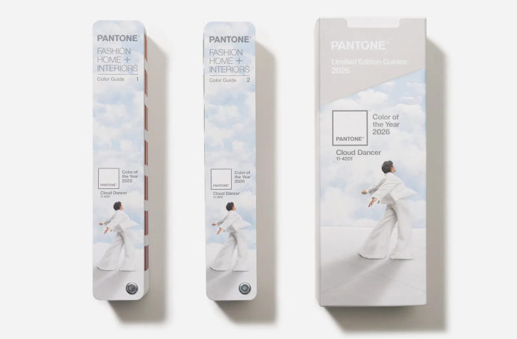
Some referenced the rising popularity of greens, warm tones, or even bold statement colors in design and fashion — highlighting how “Cloud Dancer” contrasts sharply with what many expected from 2026’s color mood.
What Pantone Says — Calm, Reset & a Clean Slate
Pantone defended its decision, explaining that “Cloud Dancer” symbolizes a desire for calm, simplicity, clarity, and mental reset — a response to the complexity, noise, and stress of modern life.
They say the hue is meant to act like a “blank canvas,” giving people and creators space to reflect, breathe, and build anew — especially after what many have described as turbulent years socially, politically, and economically.
Pantone officials also addressed questions about cultural representation: according to them, “skin tones did not factor into this decision.” They say the pick wasn’t meant to signal exclusion, but to reflect a collective mood for calm and “reset.”
What This Could Mean — More Than Just A Color Trend
- Designers & brands may rethink — Some already plan to ignore “Cloud Dancer,” opting for richer, more expressive palettes in 2026 instead of this minimalist white.
- Cultural debate continues — The backlash shows how even a color choice can carry symbolism, intentional or not. It raises questions about who gets to decide “universal” aesthetic — and whether neutrality is ever truly neutral.
- Color as social commentary — This might shift how people view “color of the year” announcements: not just as style guidance, but as reflection of societal values.
You might also want to read: The Power of Color: Unraveling the Psychology Behind Colors

